Drupal is extremely large, complicated, and challenging as a front-end developer. There isn't any one particular way to develop websites with Drupal but there are many opinions throughout the framework. This isn't the Definitive Guide to theme Drupal; this is an approach to thinking about layouts, modularity, and website architecture using Fieldable Panels Panes and the Layout Builder.
Be like water
Let's imagine that we have a client who wants a website built with Drupal to allow marketers to add customized panes. They may change menus or update social media URLs, but for the most part the site has a design that executives love and have spent money to keep for the next few years. We've agreed to create layouts and templates that match the design.
Generally to theme Drupal, you begin by creating layouts to render your content. We find most layout problems happen on design changes, especially when the DOM row structure changes; maybe the design calls for a background image or the sidebar has been removed in favor of a full width layout. These custom tailored requirements may also be required on a single page and not others. Your options become limited to building a customized selector on a specific row inside of a template or building a new template.
-
Too many layouts can be confusing and hard to maintain. Building new templates for specific case scenarios is not a long term solution and you end up with a junk drawer of variants. Creating weird case scenario items makes it difficult for other developers, or even yourself in the future, to maintain or build new features on the website. Unless you start your project with a specific plan, the naming conventions anyone will try to assign the various layouts will create confusion and waste time.
Approaching layouts by creating static variants is very inflexible since we know that the designers may change the style of each page and each row containing various grid columns, wrapper styles, and containers. We want to create a website that can handle whatever designers create, change, or add as we develop. Additionally, we want to provide a code base that other developers can alter without the fear of breaking other styles.
Static vs dynamic elements
The marketers will touch relatively little of the design in our imaginary scenario. Instead of creating regions or blocks that allows someone to customize the site from the GUI, we'll develop the header and footer statically in the page.tpl.php file. Everything the marketers touch will be used with Panels and Fieldable Panels Panes.
Drupal Layout Builder FTW
We can scaffold the marketing content using the Layout Builder GUI interface. The benefit of using the Layout Builder over traditional templates is the ability to add CSS classes per region and row instance. We'll be able to add re-usable classes without relying on scope or other bad practices in our CSS to create styles on different pages.
I've heard blanket arguments against grid systems because they can become inflexible whenever design changes are made, but I argue that if you follow some simple best practices you can avoid a lot of the scaffolding headaches. Let's look again at our example layout to see where we can add our scaffolding in an nonabrasive, modular way.
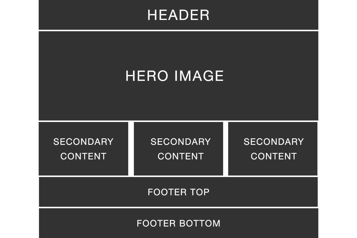
I can already see in our example where we will add wrappers, containers, and columns. However, some people might see this solution:
There is nothing wrong with adding a container wrapper around all of your content from header to footer. However, this solution isn't flexible or modular enough for a dynamic website. There is now no way to escape the container if any of the sections require a full-width background image or color.
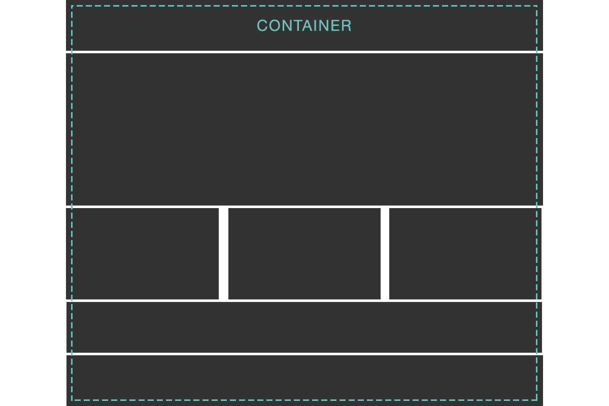
A better solution is to break each row into digestible pieces like the following:
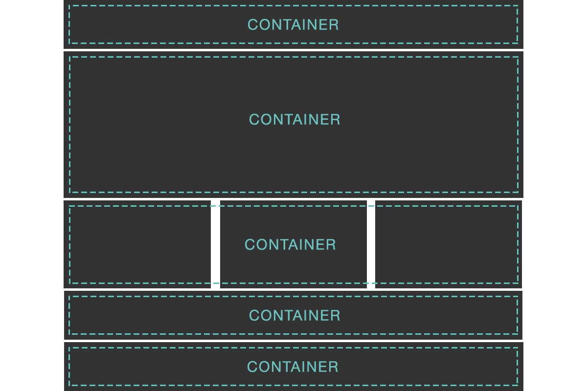
Here we can see that I've cut up the design into bite sized, modular pieces. I've added containers around each specific section as opposed to wrapping the template top to bottom. All we need to do now is add our scaffolding classes using the Layout Builder and our style classes.
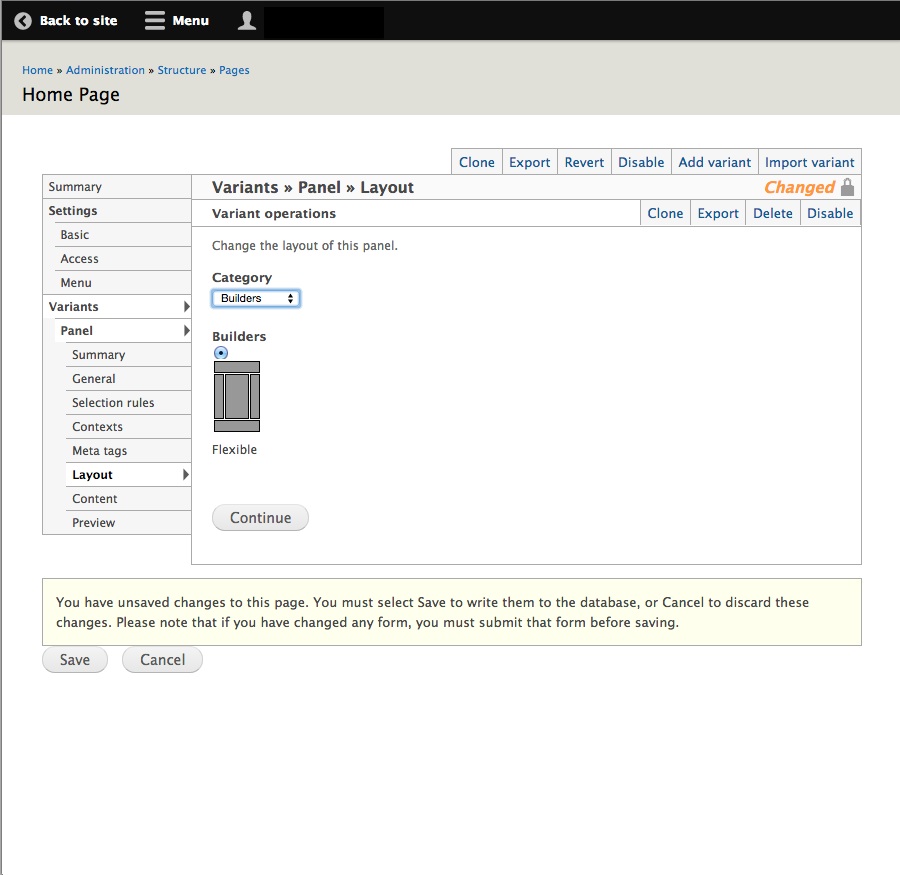
Step 1. First convert your page layout from a Category to Builders and choose Flexible
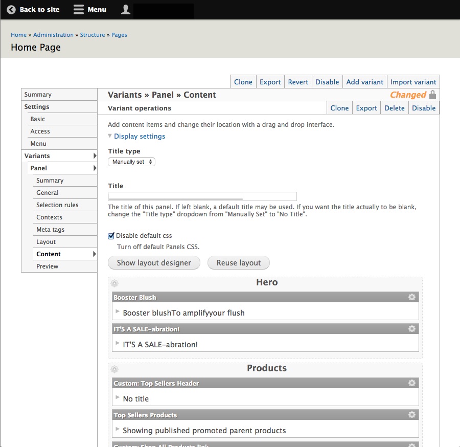
Step 2. Navigate to the 'Content' section under 'Variants'
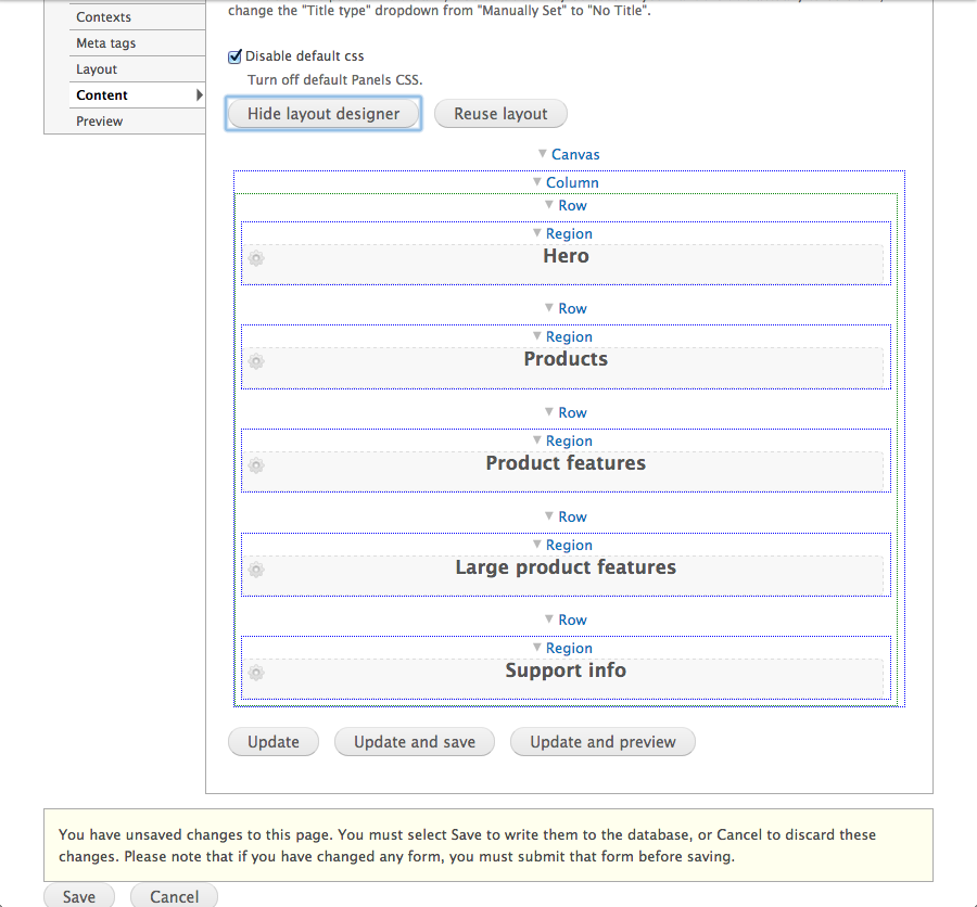
Step 3. Click 'Show layout designer'
Step 4. Profit
Recap
With Drupal's Layout Builder we now have much more flexibility to create custom solutions. We can add new rows to separate panels, a GUI to add re-usable classes, and we don't have to create confusing layout variants.