Insight | Jan 19, 2023

Tapping the Power of Fluid Typography
By Thomas Bolte
When I started my design career, it was best practice to design each component or page type by specific breakpoints, derived from the most commonly used devices. You would establish specific rules and layouts per breakpoint, creating significant shifts in your designs as you scaled down your browser that amounted to a staggering and shifting layout as you scaled down the browser. Designing this way created a lot of rules for the dev team to track and many breakpoints to QA. Screens that were between breakpoints were left with awkward layouts.
The next stage in our design evolution was to create layouts and components using patterns and principles that accommodate any screen size rather than breakpoint, so the experience was consistent no matter the device. This allowed for smooth layout scaling between wide screens to smaller devices, but the user still experienced significant jumps in text styles that drastically changed the layout of a component or page.
Cracking the Code to Fluid Typography with CSS
But that was then and this is now. Introducing a Fluid Typography. This system utilizes the same design principles as our layouts, rather than large shifts in size for various breakpoints, our text styles will also fluidly increase or decrease in size based on the user’s browser width. The brains behind the operation, our very own Engineering Manager Andy Young, provided a bit of “napkin-math” to better help explain the actual development that went into making this a reality.
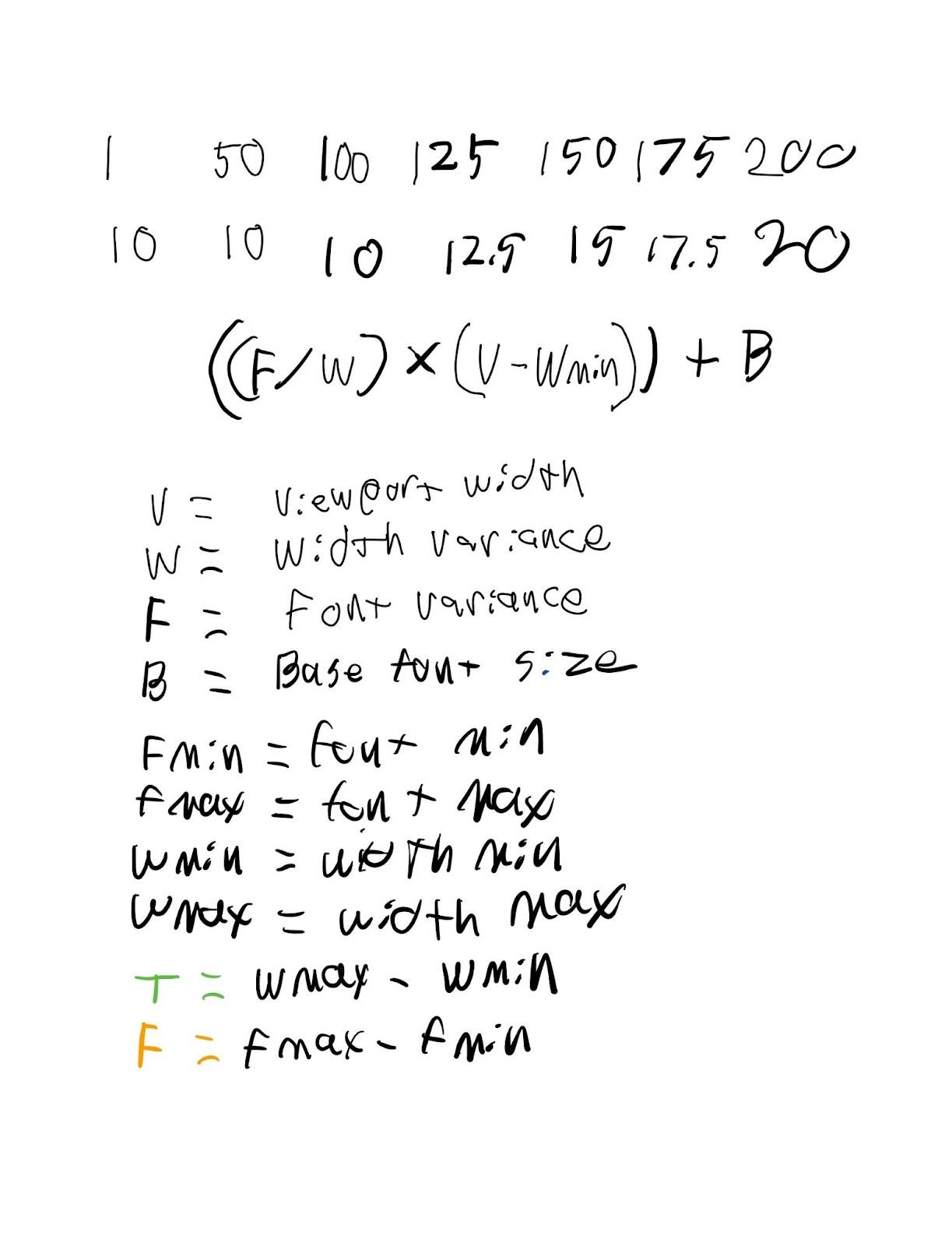
If you’re like me and quit taking math classes as soon as you could, the TLDR version is that we essentially scale each text style by a percentage of the browser width rather than specific breakpoints. This approach creates more forgiving layouts, gives the dev team fewer style changes to account for and test for, and reduces the number of responsive designs needed for a page layout.
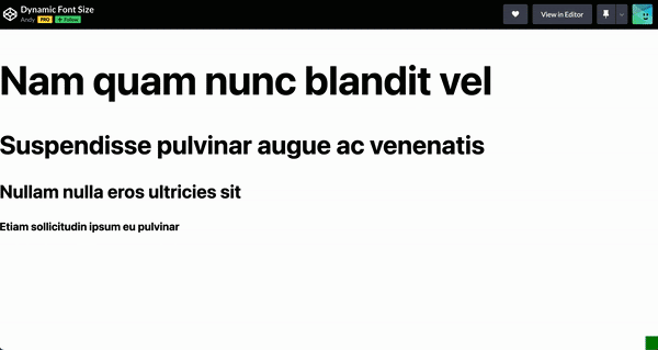
Our base development can be adjusted to fit each client’s unique brand fonts, text styles, and colors. See for yourself how we dynamically scale our typography.
The most important element of this approach is that it ensures the site experience is retained for any resolution, any page, in any combination of components. Overall, it truly embraces the ever-changing dynamic experience that is the internet.


Drop us a line
Have a project in mind?
Contacting Third and Grove may cause awesomeness. Side effects include a website too good to ignore. Proceed at your own risk.